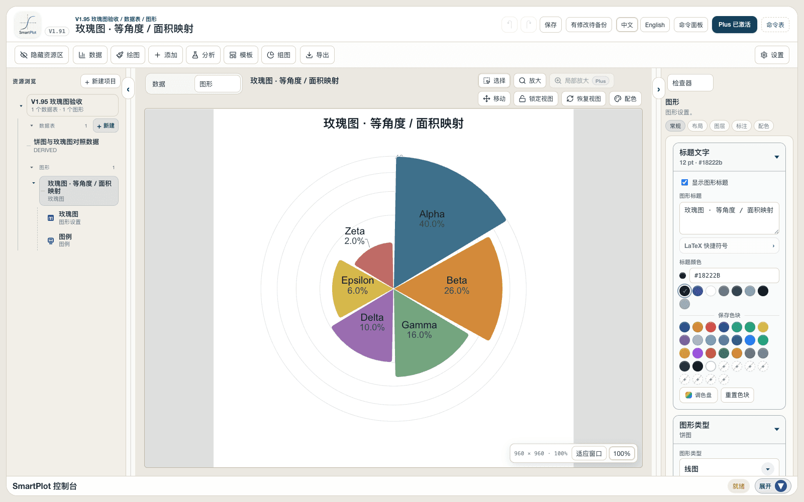
A rose chart uses equal-angle sectors and maps magnitude to sector area or radius. Unlike a pie chart, sector angle does not represent part-to-whole proportion.
Prepare a directly mappable table
Use a small set of categories with non-negative magnitudes when a radial comparison supports the story, such as directional, seasonal, or cyclical categories.
Prepare one category column and one non-negative numeric value column. Duplicate categories are combined and negative values cannot form sectors.
Practice data · categories and non-negative values
Category
Value
Alpha
40
Beta
24
Gamma
18
Delta
10
Epsilon
8
Zeta
2
Create a rose chart
Map one category column and one non-negative value column, then compare categories with equal-angle sectors whose radius or area represents magnitude.
Step 1
Open the workflow
Choose Plot → Rose Chart and use the full table or current selection.
Rose chart settingsInterface preview · non-interactive
×
MenuPlot → Rose Chart
Data range
Full table: 6 rows, 2 columns
Output
New figure
Add to existing figure
Rose chart settingsInterface preview · non-interactive
×
Category column
Category · Group⌄
Value column
Value · Y⌄
Step 2
Map category and value
Map the category column and one non-negative numeric value column; duplicate categories are summed.
Step 3
Choose radial encoding
Choose area mapping for a restrained quantitative comparison or radius mapping to emphasize differences.
Rose chart settingsInterface preview · non-interactive
×
Chart type
Rose chart⌄
Sector shape
Rounded sector (recommended)⌄
Center
SolidHollow
Rendering
2D3D
Rose chart settingsInterface preview · non-interactive
×
✓Equal-angle sectors
✓Merge duplicate categories
✓Require non-negative values
Data tableCategory value data
Mapped columns2
Step 4
Check the reading
Create the figure, then refine sector shape, gap, radial guides, labels, palette, and optional 3D presentation.
Settings and pre-export checks
Area or radius mapping
Sector, rounded-sector, or petal shape
Sector gap
Radial scale and guides
Tick and value labels
2D or Plus 3D view
Read values from the radial scale or labels, not from sector angle.
Area mapping is generally more restrained; radius mapping visually amplifies differences.
Avoid decorative petals when precise comparison is the main goal.
2D rose charts are available in Free; 3D rose rendering requires Plus.