
Lollipop Plot
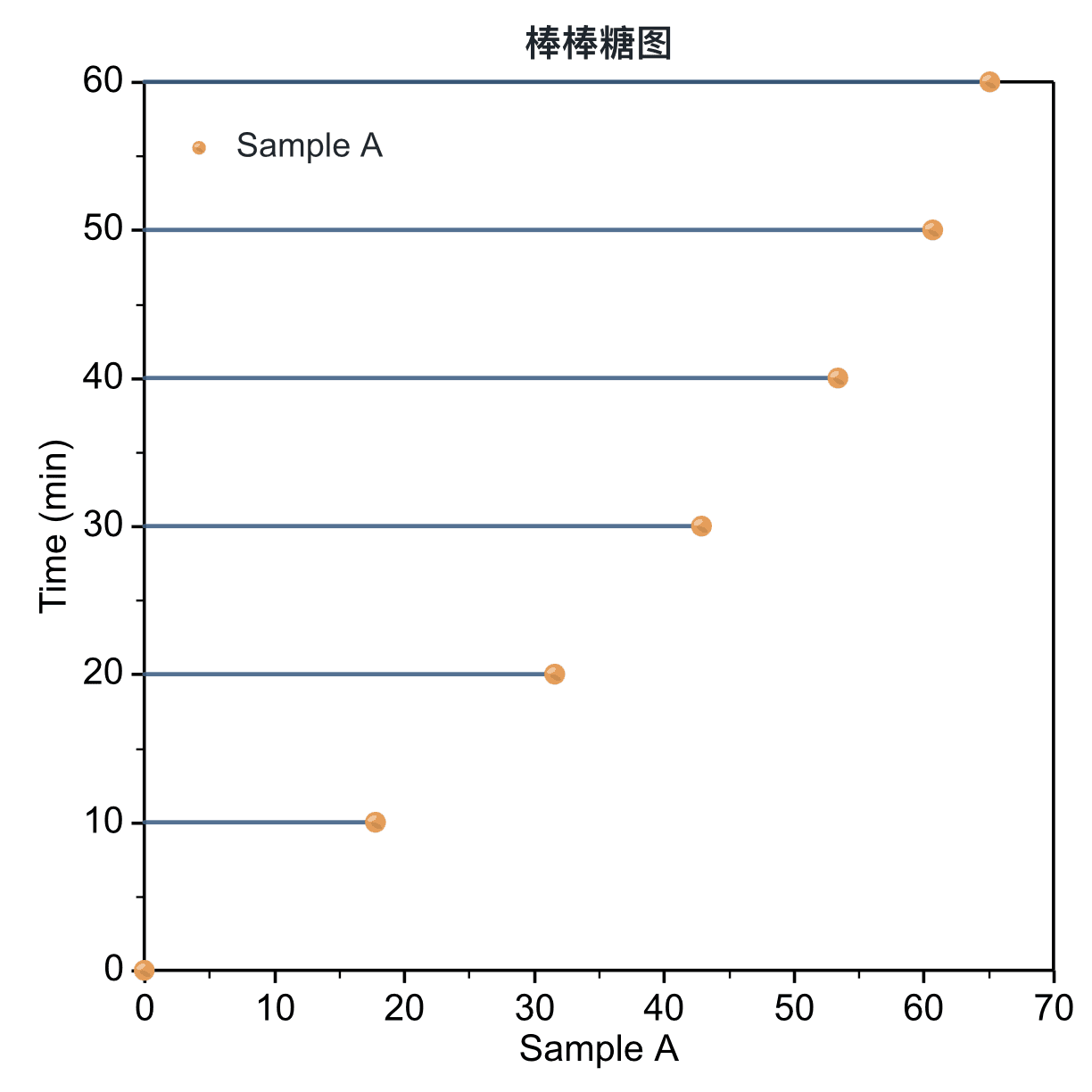
Create a lollipop plot
Complete four decisions for orientation, X mapping, and value columns.
Step 1
Choose range and output
Use the full table or current selection, then create a new figure or add to an existing one.
Step 2
Choose orientation
Vertical stems connect to the Y-axis baseline. Horizontal stems connect to the X-axis baseline and suit longer category labels.
Step 3
Choose X mapping
Shared X uses one X column for several value series. Paired X-Y gives each series its own X column.
Step 4
Map data and create
Choose the X and value columns, with optional error bars. Then refine the baseline, stems, markers, labels, and axes.
Confirm the mapping and orientation, then click Create Figure.
Create Figure
Table · 5 rows, 2 columns
Data Range
Full table: 5 rows, 2 columns
Output
New figure
Add to existing figure
Orientation
VerticalHorizontal
Vertical connects to the Y-axis baseline; horizontal connects to the X-axis baseline.X Mapping
Shared XPaired X-Y
Value · X⌄
Column 2 · Y⌄
None⌄
Adjustable settings
These are the common settings for this plot type. For detailed line, marker, axis, legend, and font styling, see Styling.
- Vertical or horizontal orientation
- Shared X or paired X-Y
- Baseline position
- Stem width and style
- Marker shape and size
- Glossy marker effect