Pie Chart
Create a pie chart
Confirm that categories and values form one whole, then choose the composition and presentation.
Choose range and output
Use the full table or current selection, then create a new figure or add to an existing one.
Map category and value
Categories may be text, numbers, or dates; duplicates are combined. Values must be non-negative.
Choose pie or donut
Pie emphasizes the complete composition; donut leaves a center area for context. Both preserve the same proportions.
Choose 2D or 3D and create
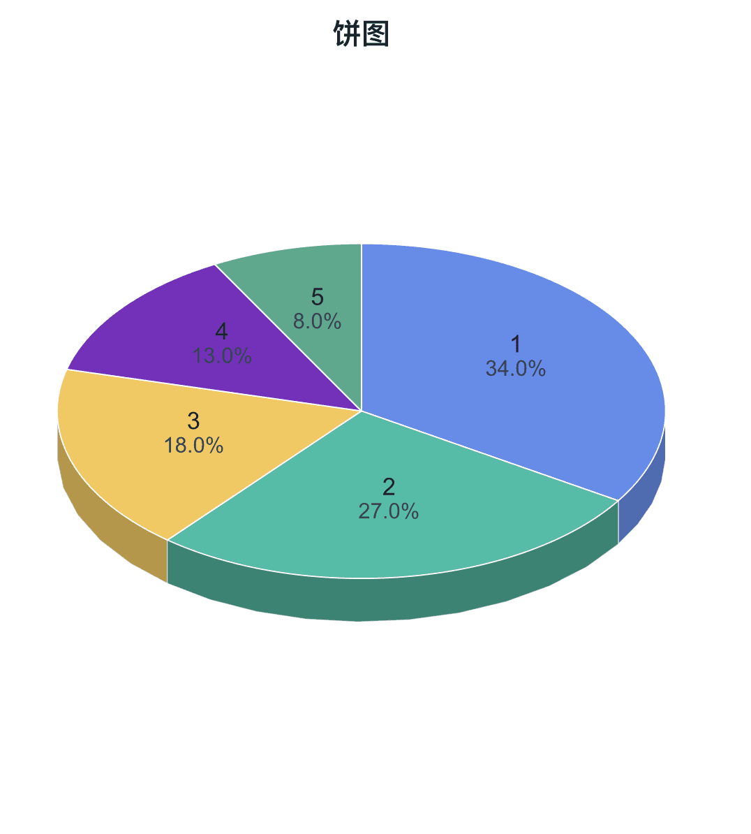
Use 2D for direct comparison. Plus 3D adds depth, tilt, and view controls. Then refine labels, leader lines, palette, and borders.
Check for negative values and excessive categories, then click Create Figure.
Create Figure
Table · 5 rows, 2 columns
Data Range
Output
Pie charts compare a small number of parts; duplicate categories are combined and values must be non-negative.
Shape
Presentation
Adjustable settings
These are the common settings for this plot type. For detailed line, marker, axis, legend, and font styling, see Styling.
- Pie or donut
- 2D or 3D view
- Category and value labels
- Percentages
- Leader lines
- Slice colors and borders