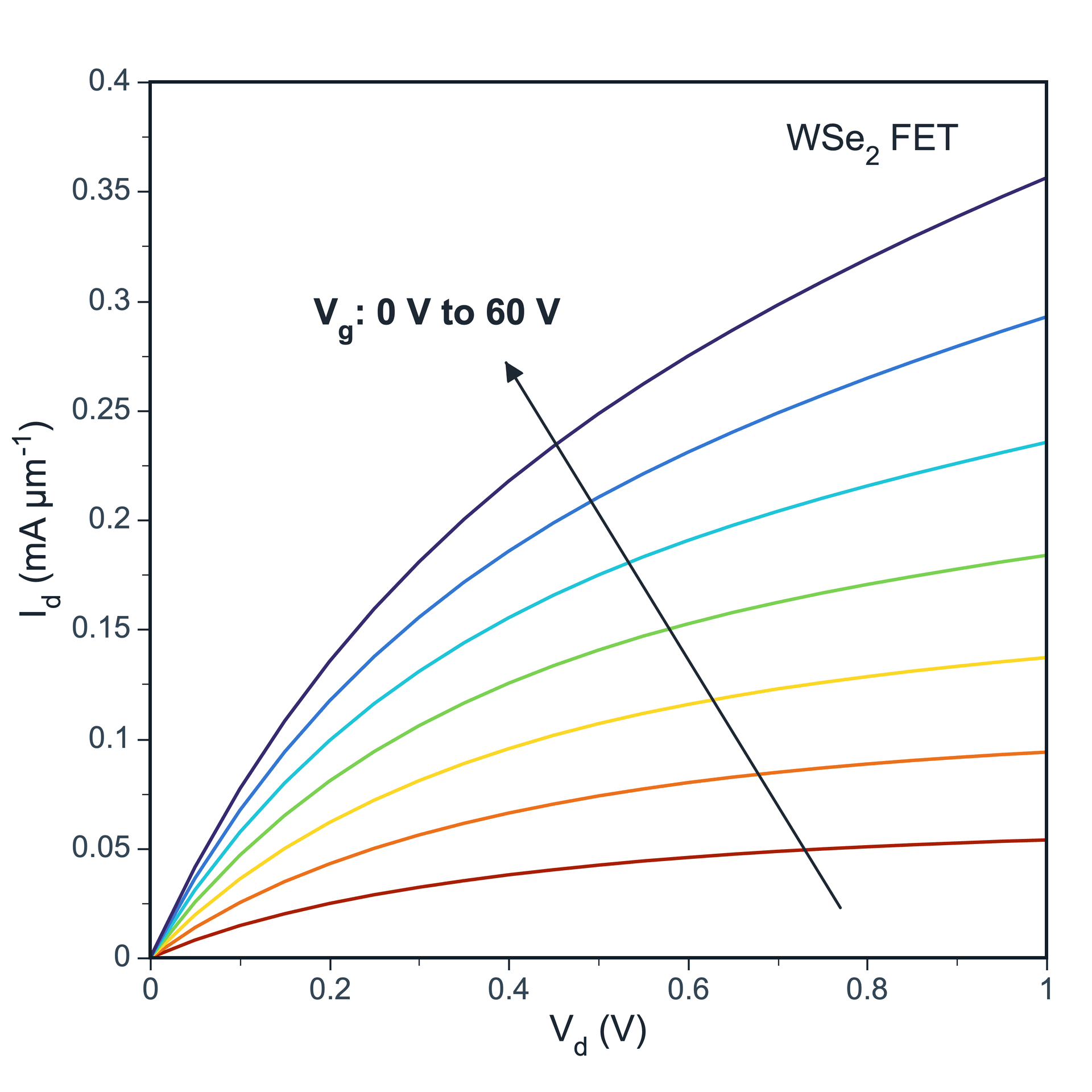
Complete 4 steps in the panel on the right to create a figure.
Step 1
Choose range and output
Choose the data range to plot, then create a new figure or add the plot to an existing figure.
Data Range
Full table: 12 rows, 5 columns
Output
New Figure
Add to Existing Figure
X Mapping
Shared XPaired X-Y
Step 2
Choose X mapping
Shared X uses one X column for multiple Y columns. Paired X-Y is for datasets where each series has its own X column.
Step 3
Map X and value columns
Choose the X column and one or more Y value columns. Add error bars if your data includes them.
X Column
Vd (V) · X⌄
Value Columns
Vg 0V (uA) · Y1, Vg 10V (uA) · ...⌄
Y Axis Assignment
Vg 0V (uA)
Left YRight Y
Vg 10V (uA)
Left YRight Y
Vg 20V (uA)
Left YRight Y
Vg 30V (uA)
Left YRight Y
Vg 40V (uA)
Left YRight Y
Vg 50V (uA)
Left YRight Y
Vg 60V (uA)
Left YRight Y
Right Y creates a Y2 axis when the figure is created.
Step 4
Assign left and right Y axes
Move series that need a secondary scale to Right Y. Right Y creates a Y2 axis when the figure is created; then refine lines, colors, axes, and legends.
Click Create Figure when everything is ready.
Adjustable settings
These are the common settings for this plot type. For detailed line, marker, axis, legend, and font styling, see Styling.