
Mixed Correlation Matrix
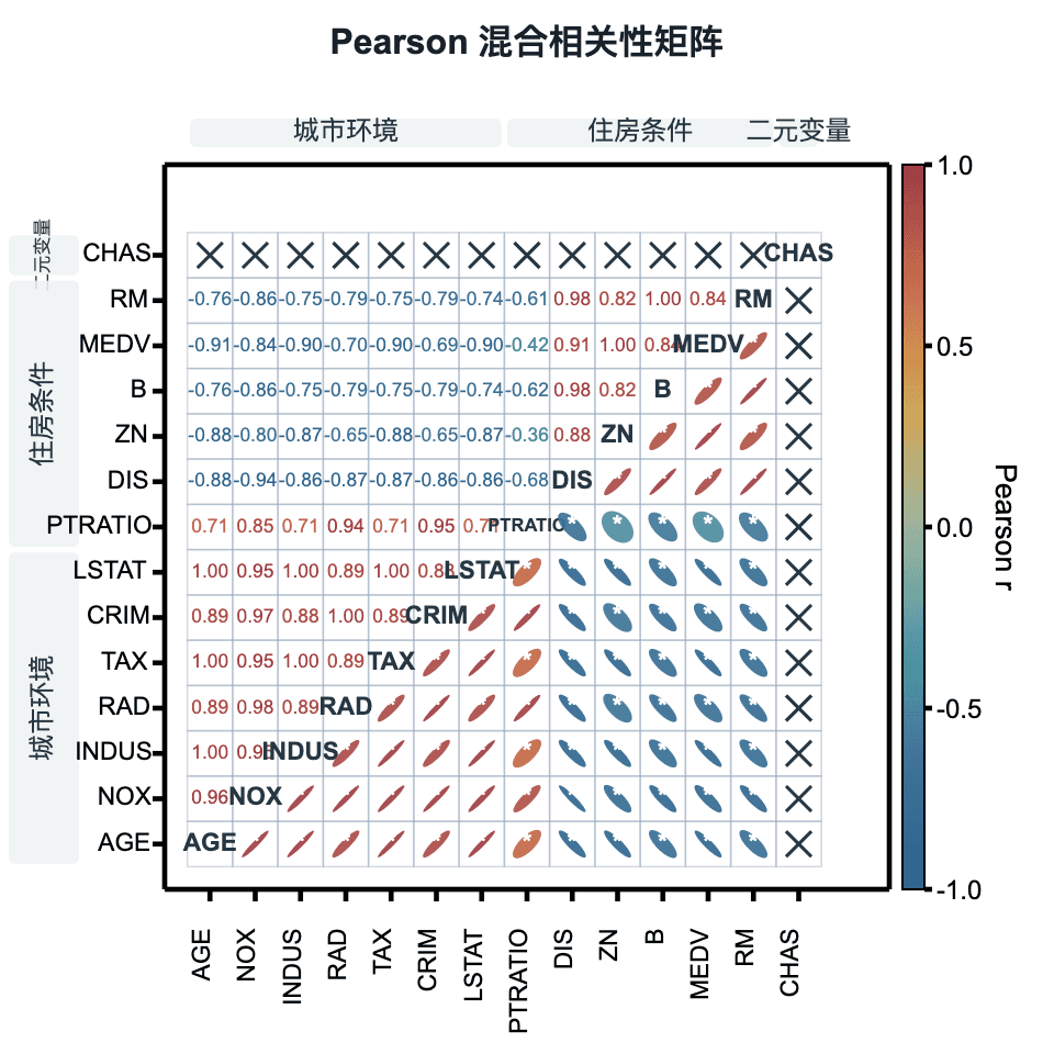
Combine Pearson r values, correlation ellipses, variable labels, and significance markers in one matrix. Mixed correlation is a Plus feature; standard Pearson correlation heatmaps remain Free.
Prepare the data
Start with a wide table: each column is a numeric variable and each row is the same sample across variables. Do not submit a precomputed correlation matrix as raw observations.
This practice table illustrates structure only and is not evidence for a statistical conclusion. Use sample IDs to align rows; do not select them as correlation variables.
| Sample ID | Metric A | Metric B | Metric C |
|---|---|---|---|
| S1 | 10 | 18 | 7 |
| S2 | 12 | 24 | 6 |
| S3 | 15 | 27 | 9 |
| S4 | 18 | 35 | 5 |
| S5 | 20 | 34 | 4 |
| S6 | 23 | 42 | 8 |
Interpretation and pre-export checks
- Correlation does not imply causation. Check outliers, nonlinearity, and sample size before interpreting Pearson r.
- A cross means the correlation is unavailable, not zero or non-significant. Check constant columns and insufficient valid pairs.
- Significance markers require available p values. Report the threshold; stars are not a measure of effect size.
- Variable groups are display labels, not sample grouping or automatic clustering.
- XYZ Curve Groups is a separate input mode: map X, Y, and value columns and choose profiles by X or Y. Do not confuse this with row-wise sample pairing in a wide table.
Adjustable settings
These are the common settings for this plot type. For detailed line, marker, axis, legend, and font styling, see Styling.
- Matrix Layout: lower values / upper ellipses / diagonal labels
- Ellipse size, opacity, and outline
- Cell grid
- Significance markers and threshold
- One-level row and column groups
- Palette and Pearson r colorbar