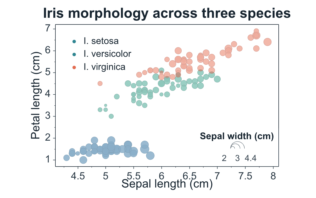
Map numeric X, Y, and bubble-size fields, then add grouping or labels only when they help interpretation.
Step 1
Choose range and output
Use the current selection or full table, then create a new figure or add to an existing one. A bubble chart needs X, value, and bubble-size fields.
Data Range
Full table: 150 rows, 5 columns
Output
New Figure
Add to Existing Figure
X Mapping
Shared XPaired X-Y
Step 2
Choose X mapping
Shared X uses one X column for one or more value columns. Paired X-Y is for series that each own their X values.
Step 3
Map position and bubble size
Choose the X column, value columns, and a numeric Bubble Size column. X and Y set position; the size field carries the third numeric dimension.
X Column
Sepal Length · X⌄
Value Columns
Petal Length · Y1⌄
Bubble Size
Sepal Width · Y2⌄
Advanced
Group Column
Species · Text⌄
Label Column
None⌄
TableirisMapped Columns4
Step 4
Add grouping and labels
Use Group Column for color categories and Label Column for selected annotations. After creation, refine area, radius, or log mapping, opacity, and the bubble-size scale.
Confirm that Bubble Size is numeric, then click Create Figure.
Adjustable settings
These are the common settings for this plot type. For detailed line, marker, axis, legend, and font styling, see Styling.