WHAT’S NEW?
SmartPlot V1.9: compose, compare, and communicate
SmartPlot 1.9 puts figure composition first, expands how pie charts can show detail and shape, adds mixed Pearson correlation matrices, and strengthens reusable workflows, direct data editing, and project recovery.
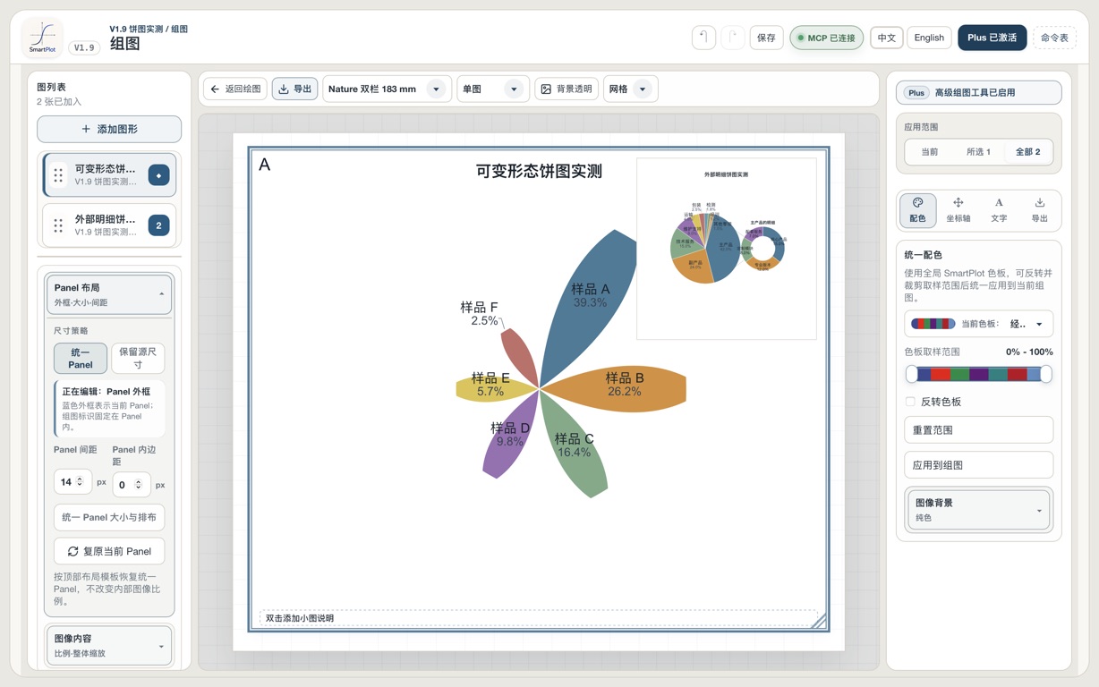
Build the whole figure in one composition workspace
The rebuilt Figure Composer keeps the figure list, panel hierarchy, canvas, and shared controls visible together—shown here with a main pie chart and an inset detail chart.
- Arrange, align, resize, and multi-select panels while keeping their layer structure visible.
- Use main–inset composition, parent–child layers, image import, and transparent backgrounds in the same workspace.
- Apply shared styling across a composition and run publication checks before export.
Choose a layout by intent, not by trial and error
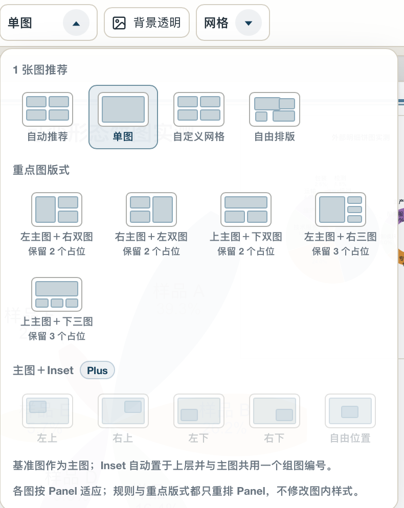
The layout picker now makes the composition model visible before you rearrange the figure: start automatically, choose a grid, use a hero layout, or place an inset.
- Start from automatic, single-panel, custom-grid, or freeform layouts.
- Use focused presets for one main plot with two or three supporting plots.
- Main + Inset presets keep the inset above the base plot and within the same composition.
Use pie charts for detail and shape—not only composition
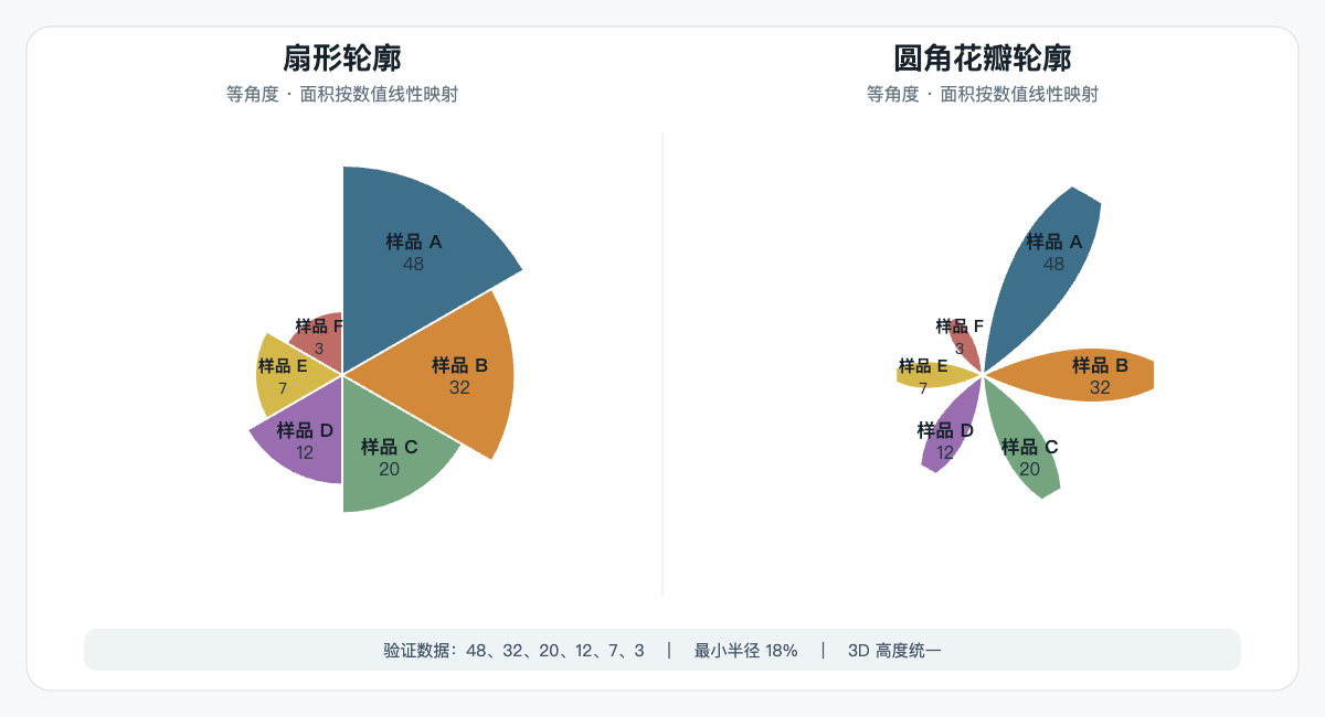
V1.9 extends the pie-chart family with a detail view for a selected parent slice and equal-angle variable-form pies that encode values through radius and rounded petal contours.
- Link an external detail dataset to a parent slice while keeping the main and detail totals consistent.
- Choose sector or rounded-petal contours, with linear area or linear radius mapping; equal-angle wedges do not encode proportions through angle.
- Advanced detail and variable-form controls are Plus features; standard 2D and 3D pie charts remain available in Free.
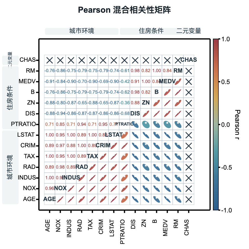
Read coefficient, direction, significance, and groups in one matrix
The mixed Pearson correlation matrix combines complementary encodings without forcing every cell to tell the same story.
- Keep variable labels on the diagonal and exact coefficients in the lower triangle.
- Use ellipse direction, color, and shape in the upper triangle, with significance markers when needed.
- Add one-level row and column grouping to keep larger matrices readable.
Also included in V1.9
Pearson correlation heatmaps remain available in Free, including matrix results and heatmaps generated from wide tables.
Standard pie charts can merge slices below a threshold; standard 2D and 3D pie charts remain Free.
Quiver plots can map color from an independent numeric column, with more research-oriented palettes across chart families.
Box plots add custom box percentiles and whisker rules for more explicit distribution summaries.
Workflow templates now cover more analysis steps, X–Y pairing, history, duplication, descriptions, versions, and JSON import/export.
Direct spreadsheet entry, consistent project snapshots, recovery diagnostics, and safer reopening make everyday work more resilient.
Past News
SmartPlot V1.85
August 17, 2026Pie, donut, and lollipop plots, reusable analysis workflow templates, function reference lines, and editing refinements.
Issue 1.75SmartPlot V1.75
July 22, 2026Radar charts, grouped layers, denser data tools, analysis updates, and a broader Smart Panel.
Issue 1.7SmartPlot V1.7
July 14, 2026A new chart workflow, data analysis tools, workflow upgrades, and many interface refinements.