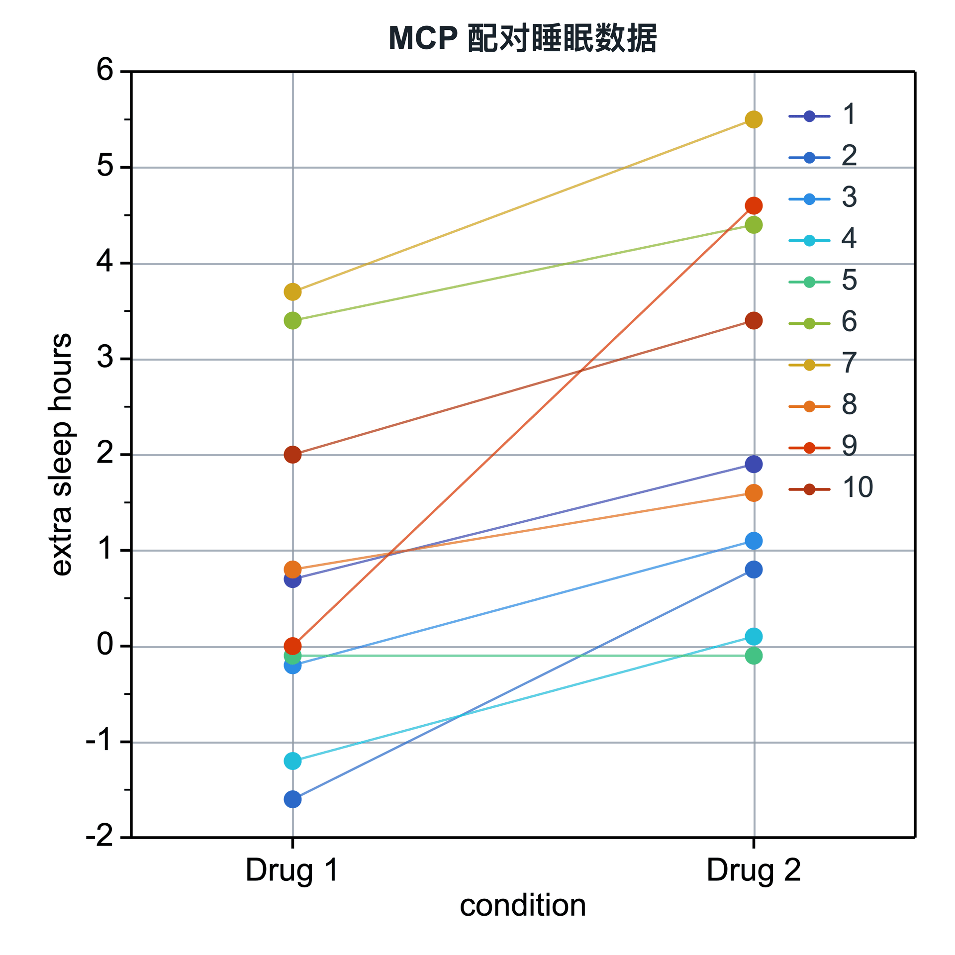
Paired Scatter Plot

A paired scatter plot connects repeated observations from the same subject, making individual direction and group-level change visible at the same time.

Prepare a directly mappable table

Use repeated or matched measurements in which the same subjects, samples, or units are observed under two or more conditions.

Prepare a long table with one subject-ID column, one condition column, and one numeric measurement column. Each row is one observation.

Practice data · long-table structure
subject_idconditionsleep_hours
01Drug 10.7
01Drug 21.9
02Drug 1-0.2
02Drug 21.1
03Drug 1-1.6
03Drug 20.8
04Drug 1-1.2
04Drug 20.1

Create a paired scatter plot

Use a long table to tell SmartPlot which observations belong to the same subject, which condition each observation belongs to, and which value should be plotted.

Step 1

Open the workflow

Choose Plot → Paired Before–After Plot and use the full table or current selection.

Paired plot settingsInterface preview · non-interactive
MenuPlot → Paired Before–After
Data range

Full table: 8 rows, 3 columns

Output

New figure

Add to existing figure

Paired plot settingsInterface preview · non-interactive
Subject ID
subject_id · Group
Paired condition
condition · Group
Measurement
sleep_hours · Y
Step 2

Build the pairs

Map the subject identifier, paired condition, and measurement columns. The subject and condition columns must be different.

Step 3

Connect and color

Check the detected condition order, then choose line or arrow connectors and color by condition or subject.

Paired plot settingsInterface preview · non-interactive
Connector
Line
Line style
Solid
Color by
Condition
Show subject IDs in legend
Paired plot settingsInterface preview · non-interactive
Show subject IDs in legend
Check condition order
Keep incomplete pairs
Data tablePaired sleep data
Mapped columns3
Step 4

Check before export

Create the figure, then refine marker style, connector appearance, condition colors, and the optional subject legend.

Settings and pre-export checks

  • Condition order
  • Line or arrow connectors
  • Solid, dashed, or dotted lines
  • Color by condition or subject
  • Marker opacity and size
  • Optional subject legend
  • Use a stable subject identifier so observations are paired correctly.
  • Check missing observations before interpreting incomplete lines.
  • Keep condition order meaningful, such as Before → After or Control → Treatment.
  • A subject legend is usually unnecessary unless subjects are deliberately color-coded.
Continue to styling